Logo
The Mark of the Mechanic
The Rico Brunner logo is a stamp of substance. It stands for 28 years of research and clear energetic mechanics. It is an instrument for identification not a decorative element.
We use it with purpose and absolute precision.
Primary Logo
This combination mark is the primary tool for visibility. It unites the RB symbol and the wordmark. It stands for the person and the craft. Use it as the standard across all main touchpoints. The logo operates purely in black and white.
1. Choice: Black positive

Download the BLACK SLATE LOGO
Variation: White negative

Download the OFF WHITE LOGO
Proportions and Construction
The relationship between the RB symbol and the RICO BRUNNER wordmark is mathematically fixed. The symbol acts as the anchor. The distance between the symbol and the wordmark equals exactly the width of the letter ‚R‘ in the wordmark. These proportions are locked and must never be altered manually.
Alignment
When placing the primary logo the optical baseline of the wordmark and the center of the circular symbol align horizontally. Always use the provided vector files which have this alignment preconfigured.
Minimum Size (Primary Logo)
Legibility is an absolute requirement. Below certain dimensions the mechanical precision is lost.
Print: Minimum width 30mm
Digital: Minimum width 120px
Brand Mark – The Symbol
Reduced to the absolute core. This symbol is used strictly for highly constrained spaces like avatars and app icons. It never replaces the primary logo for introductions.
Download BLACK SLATE MARK

Download the OFF WHITE MARK
Technical specs
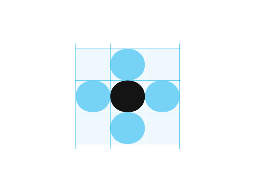
Clearspace: Height of the symbol.
Min. Size Print: 10mm height.
Min. Size Digital: 32px height.
Colour & Context
Clarity is non-negotiable. The logo requires absolute contrast to function properly. Solid backgrounds are the standard.
Usage on Images – Transparent Versions
When placing the logo on photography or video, always use the transparent file version (SVG/PNG). Never use the logo inside a white box or frame.


Overlay Image


Technical rules
- Legibility First
Ensure total clarity. If the background is too loud use a subtle overlay or change the image. - No Interference
The logo never covers faces or essential visual information. - Solid Presence
The logo is always completely opaque. Transparency implies hesitation. We show up with 100% opacity
Do’s & Dont’s
Do’s
- Respect the clearspace boundary
- Use SVG for web and vector formats for print.
- Align with the layout grid.
Dont’s
- Do not stretch distort or bend.
- Do not add colours.
- Do not detach the symbol from the wordmark.
- Do not rotate.
- Do not apply shadows or visual effects.
- Do not place on cluttered backgrounds.
File Formats & Usage
Choosing the correct file format is just as important as the design itself. To ensure the Energyology brand always appears crisp and professional, whether on a mobile screen or a large-scale print, you must use the appropriate file type for the medium.
Vector vs. Raster: Always prioritize vector formats (SVG, EPS, AI) as they scale infinitely without losing quality. Only use raster formats (PNG) when software limitations require it (e.g., Office apps, Social Media).
Format Guide
| Format | Type | Best used for |
| SVG | Vector | Primary Web Format Websites, Apps, UI Design. Always sharp, low file size. |
| EPS / AI | Vector | Primary Print Format Brochures, Clothing, Vehicles, Large signage. |
| PNG | Pixel (Raster) | Office & Social PowerPoint, Word, Social Media Posts. Supports transparency. |
| JPG | Pixel (Raster) | Avoid for Logos Only use if absolutely necessary and no transparency is needed. No scaling allowed. |